

Flexbox is itself a very complicated topic to understand, they say! And Flex-grow, flex-shrink makes people make their heads scratch. So let's understand this topic in greater detail and see some examples. To conquer this thing forever.
But is it?
This article is essentially a part of the Flexbox series, which I have been doing here for some time now. In these articles, I have decided to break down the topics into little chunks according to their relevance.
Flex-grow
The name suggests it all and it's really that simple. It gives the element to grow if the screen size is changing.
- The element is supposed to take up x times more space than the regular one, or
x- atimes more than the one which has less value than them.- _X is the numeric value that is passed in
flex-grow: < x >;.
- _X is the numeric value that is passed in
- Auto value means Browser will check the width and length of content and give the value accordingly, but it will certainly be larger than the rest of the siblings.
- Negative numbers are not supported.
Syntax
.list:nth-child(2){
    flex-grow: 2; /* The 2nd item will grow 2 times as the normal children. */
    flex-grow : auto | 0 / <numeric> | x%;
}
Example
See the last for a better understanding.
Flex-shrink
Opposite of flex-grow, really that simple. It plays a major role in the responsiveness of the webpage.
- The element is supposed to shrink down
_1/x_than the regular one, orx- atimes less than the one which has a less high value than them.- X is the numeric value that is passed in
flex-shrink: < x >;.
- X is the numeric value that is passed in
- Auto value means Browser will check the width and length of content and give the value accordingly, but it will certainly be larger than the rest of the siblings.
- Negative numbers are not supported.
Syntax
.list:nth-child(2){
  flex-shrink: 2; /* The 2nd item will shrink twice that of normal children. */
  flex-shrink : auto | 0 / <numeric> | x%;
}
Example
See the last for a better understanding.
Flex-basis
In the most simple words, it is another way to say the width or height of the element depending upon the direction of the flex-items (if row then width or height if column). It gives the element ability to take up a certain amount of space by default, in the row/column, irrespective of the fact that total space is supposed to be equally distributed among all.
- It can be seen as defining the Width of the element in the direction of the respective axis.
- The values can be
%, rem, em, px, calc(), clamp() , etc. - When it is set to Auto, it's set to a natural state, i.e. width of the actual element.
Syntax
.item{
flex-basis: x% | Xrem | Xem | calc() | clamp() | px ;
}
Example
See the last for a better understanding.
The Shorthand
The most awaited stuff, but why it is more to learn all of the above to understand this one better, because that is the base of all the value it takes.
- Like the grow works the same,
- Shrink works the same,
- Basis works the same.
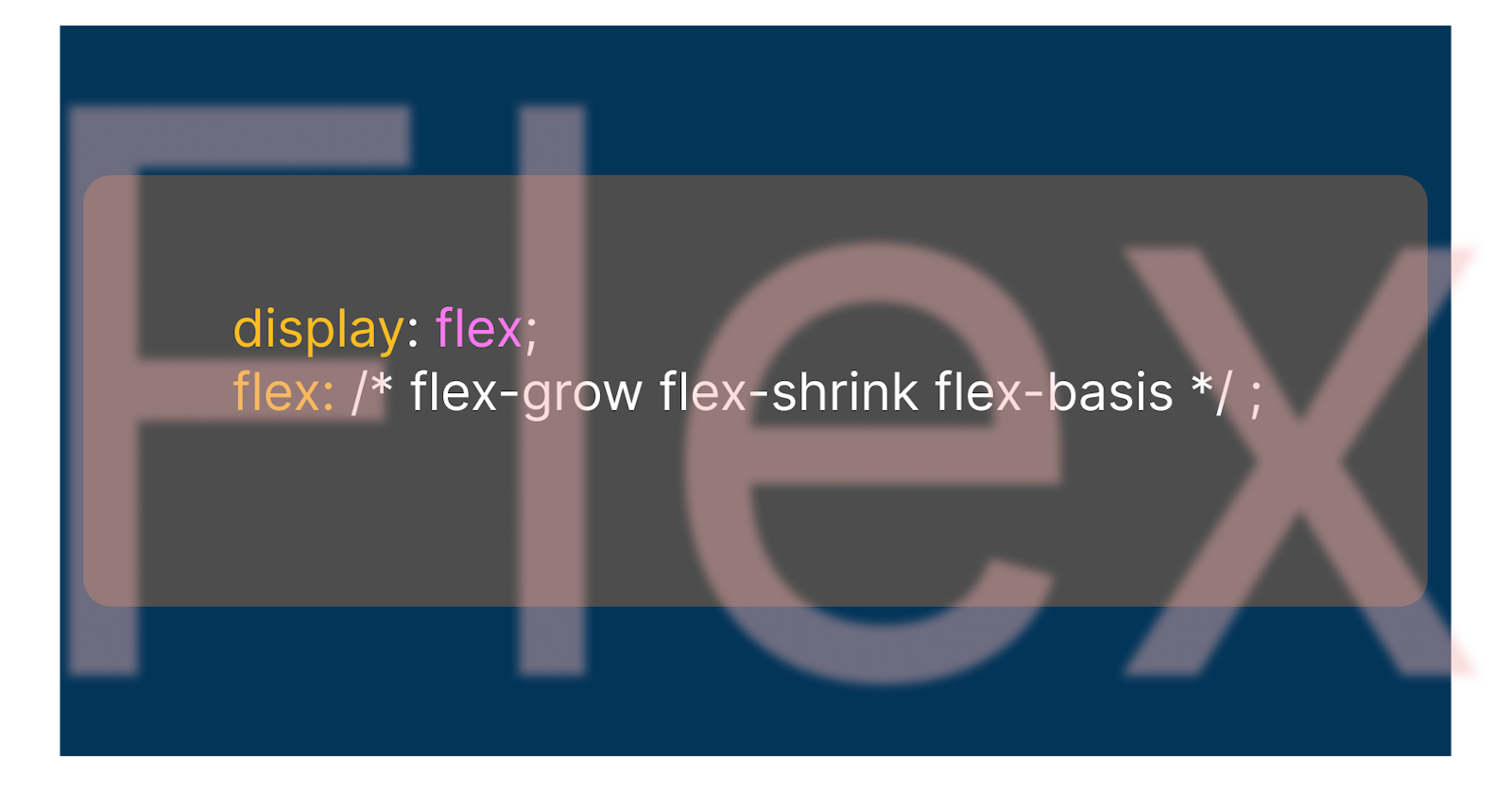
Flex
It is the [[ShortHand]] of flex-grow & flex-shrink & flex-basis respectively.
- It goes in this order only.
- Not defining any value to any property will set it to default.
- Auto is default and that is equal to " 1 ".
Syntax
.item{
    flex: 5; /* here we are only setting the grow property and rest as default */
    flex: 1 1 0%; /* here grow: 1, shrink: 1, basis: 0% */
}
Example
In this Code-pen, I have all of the above and also added a few examples of flex-direction, gap, and many more.
I want you to take this code-pen to your account and play with it to understand it better.
- Here you will see an example of a
flex-basisused in such a way that it sets the width and height of the element in one short.- This can be taken as a Smart guide to writing Smart flexbox.